From Prop to Pop - Designing Dirty Laundry
In the world of independent filmmaking, there's everything you know you need to make a movie - crew, talent, cameras, lights, locations. Then, there are those things that sorta sneak up on you. Like, "Okay we know the title of the movie, but what does the title look like?" The look of a film goes beyond lens choices, lighting, and even hair, makeup, and wardrobe. Everything from fonts to colors to textures impact the film’s look and feel on posters, trailers, social media, and more. It’s branding for a movie, and it takes a whole lot of work to do it right.
Fortunately, for Dirty Laundry, we were lucky to have an incredibly talented Art Director, Eric Thaddeus Andrews, who was already sketching, doodling, and designing the look and feel of the film way before the cameras even started rolling. Andrews’ wide array of talents includes cinematography, photography, drawing, and more, making his experience a great match for the character he’d spend the most time creating artwork and props for.
Art Director, Eric Thaddeus Andrews, adds drawings to props as the talent and crew prepare for the next scene.
Sketching the Story
“Kyle Miller, one of our film’s main characters, is always sketching new ideas,” explains Writer/Director Rocky Walls. “And one of our earliest decisions was to ensure the props -sketchbooks, art supplies, and even Kyle’s backpack - in the film felt very authentic.” Andrews was brought onto the Dirty Laundry crew before some of the characters had even been cast. “I think Eric was maybe the fourth or fifth person to read the script,” says Walls.
“I was interested from the start about this 19-year-old, very creative kid who has this idea and this ambition and puts all of his thoughts into these notebooks and sketchbooks,” Andrews recalls. “I liked the idea of some of that coming through in the storytelling. It’s not just, like, ‘Oh yea, he’s drawing,’ but when you see an image, it references something that’s actually happening plot-wise.”
In particular, Walls knew Andrews possessed a mastery of sketching as a journaling technique. “Something I’ve always admired,” Walls explains, “is that, often, I feel like Eric is drawing something and he doesn’t know where or if it has an end. It’s not as though he knows when it’s complete because it’s what he pictured in his head when he started.” This style of sketch journaling met the needs of the film’s narrative perfectly, since Kyle’s art skills are not nearly as important as the fact that he uses art to capture and outwardly express his internal feelings and ambitions.
“When I was thinking about Kyle as a character,” Andrews recalls, “he’s skipping college education to go straight into his dream. He’s had high school art courses and he’s been drawing on his own, but he’s not trying to be some sort of illustrator. He’s got 800 ideas going on at once and his sketchbooks are his way of getting his thoughts down. The story that comes through the sketches is more important than the way it’s drawn.”
Kyle Miller (Mitchell Wray) sketches during his work shift at a local coffee shop in this behind-the-scenes photo.
Nineties Nostalgia
In the film, Kyle (Mitchell Wray) dreams of launching PropPop, a party photo backdrop business, with his best friend, Eric Hernandez (Charlie Schultz). Eric, however, burdened by the weight of parental expectations, dawdles as a dutiful eldest child, wary of diving headfirst into Kyle's grand scheme. Eric’s reluctance has left them both in a yearlong state of limbo, so Kyle has had plenty of time to FILL his sketchbooks with ideas for PropPop. The designs he’s dreamed up are vibrant, colorful, and reflect Kyle’s character as well as the 90s setting of the film.
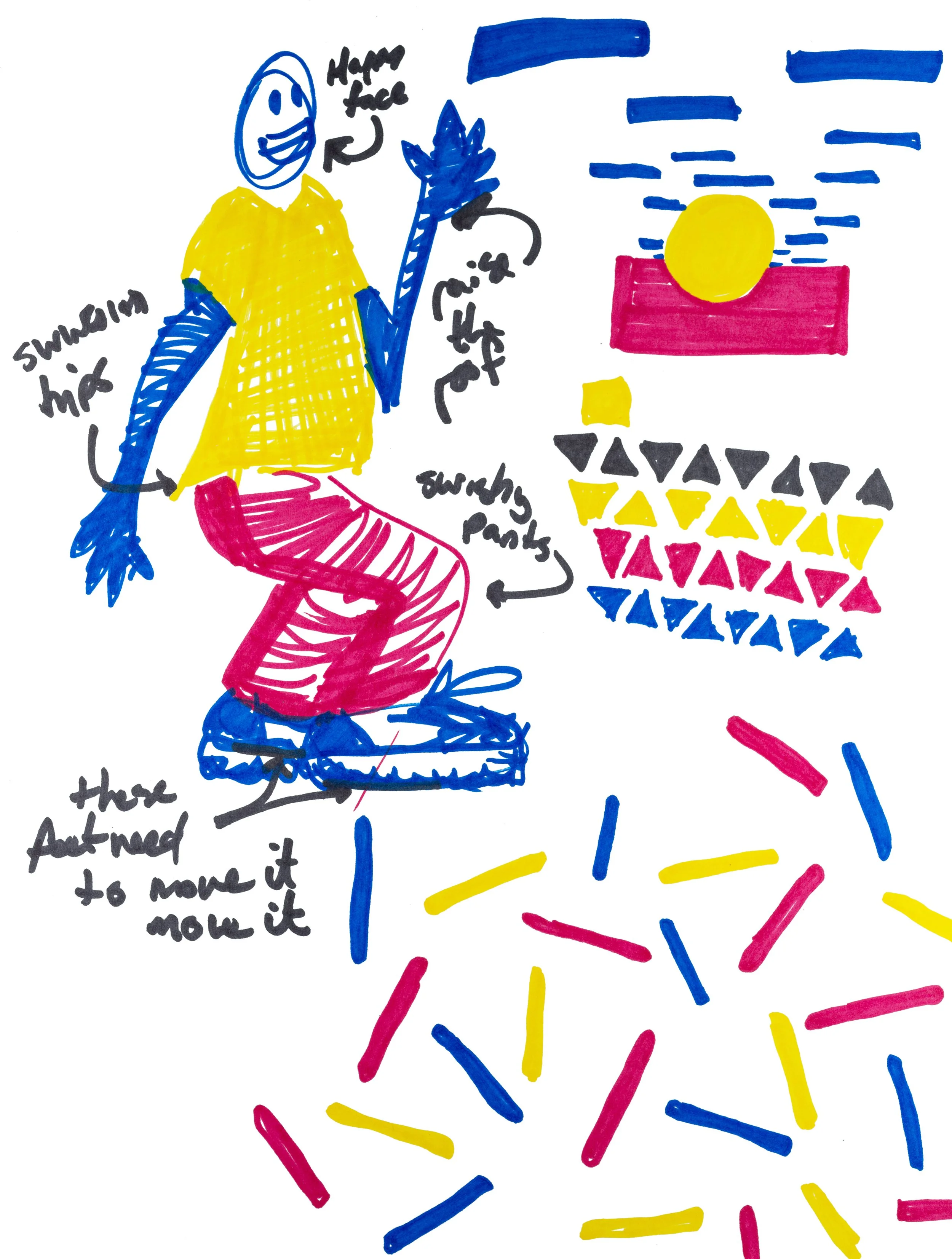
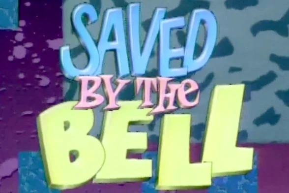
“Kyle is nineteen,” Andrews recounts, “He’s definitely into MTV. He’s kind of punky - I felt like bright colors made sense. After doing some research, I found that something called Memphis Design was very prominent - that’s the classic, triangles and clashy bright colors and patterns.” Andrews’ description instantly conjures up the aesthetic from films, TV shows, and toys throughout the 90s.
“These are the things I considered while coming up with background designs,” continues Andrews. “Because in my mind, he’s figuring out what’s going to make a good backdrop for someone’s birthday party or someone’s wedding.” And it’s not just the designs of the backdrops for PropPop - it’s branding the company itself. “There’s even a plot point where he’s unveiling the newly designed logo to Eric and I did several iterations of that logo, all playing with triangles and Memphis Design and primary colors,” says Andrews.
From Sketchbook to BIg Screen
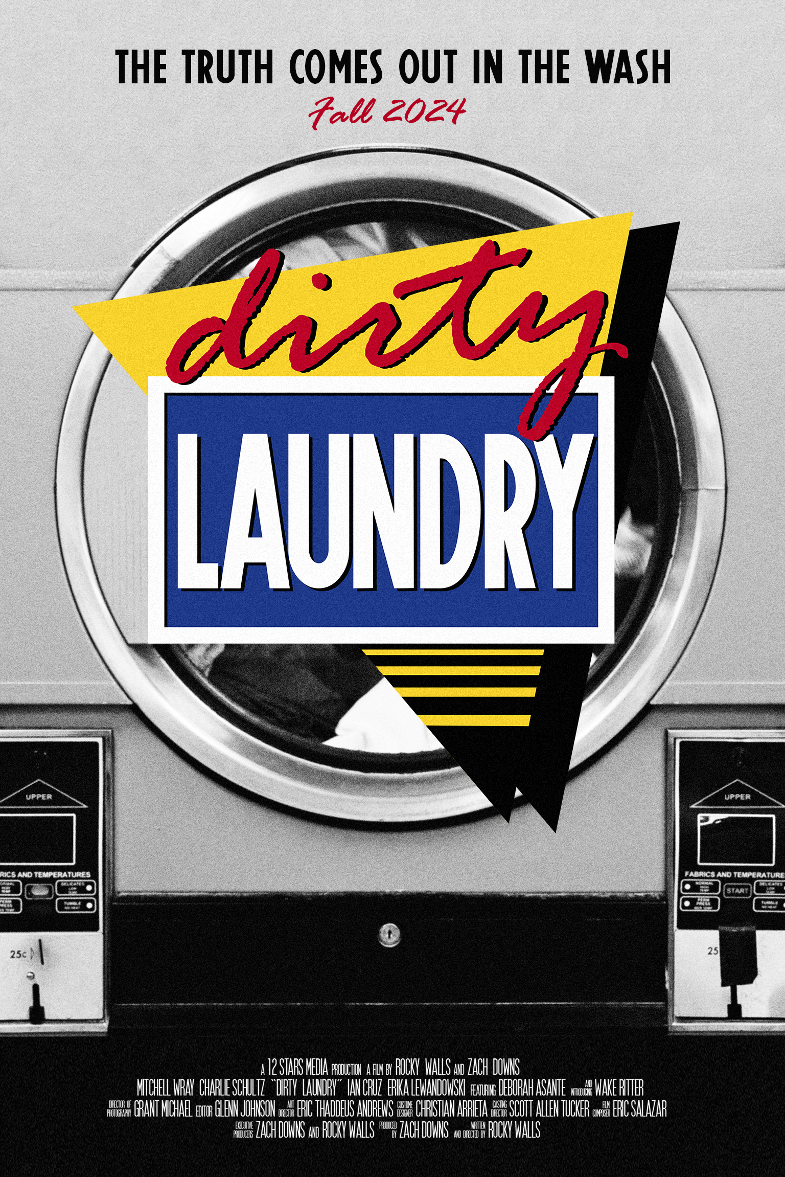
What started as props - sketchbooks, pens and pencils, a backpack - became another representation of the story. So much so, in fact, that those materials became the first place the team looked as they started thinking through promotional materials for the film. “As we considered how the film title would appear in promotional materials like the website, social media, and the official posters,” Walls explains, “we turned to the PropPop logo designs in Kyle’s sketchbook.” By combining those design elements with one other creative inclusion, a rendition of the actual “LAUNDRY” sign from the exterior of the laundromat, the team was able to extend the artwork and the narrative even further - from the prop of a sketchbook to the pop of a movie title logo!
If this behind-the-scenes look fascinated you, be sure to join the Laundry List, our email newsletter designed to help you stay on top of news, events, and other special updates about Dirty Laundry. Subscribers will be the first to find out about the film premiere and other screenings, so don’t miss out. Sign up below!
And, if you’re excited to see the movie, download the Official Teaser Poster and share it on social media to help spread the word.


